It’s a new year, and that means it’s a good idea to check in on resume trends, recruiter preferences, and ATS requirements.
As the job search process becomes more complex and technology-infused, the resume writing process has to follow-suit.
So, I want to draw your attention to 4 areas of resume formatting that combine to create the all-important ‘first impression’ you’ll make on any potential employer you apply to. Those 4 formatting areas are: resume layout, resume length, resume fonts, and resume colors.
Wanna make sure your resume is on point?
Download my 5-Step Action Plan to Write an Interview-Getting Resume.
LAYOUTS
First, let’s look at resume layouts. There is a very definite ‘look’ to a well-crafted resume in 2021, and while that ‘look’ may vary in style, the basic formula is pretty consistent.
Your resume layout includes your sections, margins, text alignment, indentions – pretty much everything about the way the content on your resume is, well…laid out.
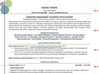
For maximum effectiveness, resumes in 2021 should contain the following sections (in more-or-less this order):
- Contact information (in the body of the document, not in the Header section)
- Profile / Summary
- Skills
- Professional experience
- Education
Keep in mind that every situation is different, and there are very few hard-and-fast rules when it comes to resumes. While the list above recommends the most widely accepted order, there may be situations that call for something slightly different.
Always try to follow best practices and recommendations, but also be flexible if your situation needs a slight adjustment. If you’re not sure, try to reach out to someone knowledgeable for help.
Other common sections that you may want to include are:
- Career Highlights
- Earlier(/Early) Career
- Professional Affiliations
- Certifications / Licenses
- Training / Professional Development
Another preference for resumes this year is to use clean lines for your text, consistent alignment, and carefully positioned ‘whitespace’ to ensure optimum readability.
This means justified alignment throughout:
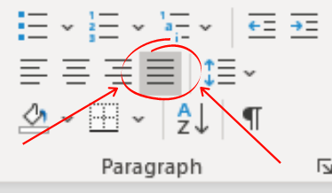
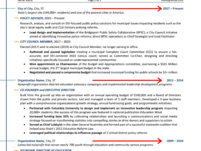
It also means aligning your employment dates consistently in the same place. The best alignment for your employment dates is along the right-hand margin, because that is where most Applicant Tracking Systems (ATS) are programmed to look for them, and it’s where most recruiters and hiring managers prefer to see them, as well.
Whitespace refers to any space on the page that doesn’t include text: margins, indentions, tabs, and line spacing.
While the content in your resume is what you want the reader to notice, the whitespace on the page can help them to comprehend that content more easily, and can even help guide them to the most important information you want them to see.
A resume that is too cluttered with text is going to lead the person on the other end to feel overwhelmed and not want to read it at all.
Use whitespace efficiently and consistently to be most effective.
The final piece of the puzzle when it comes to your resume layout is how the text itself is laid out on each line, especially when it comes to your job descriptions.
For your job descriptions, you should include (1) overall ‘big picture’ items of what you were hired to do, (2) major day-to-day responsibilities, and (3) achievements.
While item (1) can often be best formatted in a short, succinct paragraph, for (2) – and often for (3), as well – it’s most effective to use bullet points to separate each idea. This helps the content be easier to read and understand by a busy recruiter.
And finally, when drafting your bullet points, it may be helpful to keep in mind the F-pattern that has become common for on-screen reading.
The F-pattern is the basic pattern most readers’ eyes follow when reading on-screen content.
So, as you are crafting and editing the content for your bullet points, keep in mind the pattern they create on the page and see what you can do to create an F-pattern where possible.
LENGTH
One of the most persistent myths about resumes over time has been the idea that a resume should be a certain length – specifically, 1 page.
While a 1-page resume certainly is acceptable, it is by no means a must.
Beyond that, while a 1-page resume can be effective for some, it often does not provide enough content to demonstrate the full range of skills and experience acquired during longer careers.
Resume length, as a best practice, really comes down to relevance.
However much space it takes to convey the most relevant pieces of your career history is how long your resume should be.
With that said, the VAST majority of resumes should fall between 1-3 pages.
Professionals with less experience (or less experience that’s relevant) may only need 1 page, while most professionals with more than 2-3 years’ experience will need 2.
High-level executives, Board of Directors members, and other professionals with extensive and highly-relevant experience may need 3 pages.
More than 3 pages is not advisable in most cases.
When circumstance does call for more than 3 pages, this is typically considered a CV (curriculum vitae) rather than a resume.
FONTS
It may seem like a low priority issue, but the font you choose for your resume can have a major impact on whether or not you’re chosen to interview for your dream job.
You may be thinking: ‘Really, lady? Some hiring manager is going to decide they don’t like my resume because I used Times New Roman font?’
No, of course not.
Well actually, maybe – especially in the case of Times New Roman, where an article on Bloomberg stated, “Using Times New Roman is the typeface equivalent of wearing sweatpants to an interview.”
So, I’ve compiled a list of 4 of my favorite resume fonts for you that are Applicant Tracking System (ATS) compliant and approachable enough to please just about any reader. For a more thorough look into resume fonts, you can bookmark 9 Best Resume Fonts Recruiters Don’t Hate.
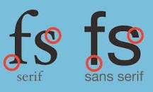
SERIF vs. SANS SERIF
If you’re unfamiliar with these terms, serif fonts are those with semi-structural details or small decorative flourishes on the ends of some of the strokes that make up letters and symbols. Sans serif fonts do not have these details or flourishes.
According to Hannah Craig of Jobscan,
“If you’re applying for highly compliant, regulated, or formal fields, serif is the way to go. Serif fonts are perceived as reliable and traditional. They lend an air of authority. Use this to your advantage if you’re working in finance, law, or science or if you’re applying to companies with a long history and formal structure.
If you’re working in innovative and newer fields, sans serif is a good fit for your resume. Sans serif fonts are perceived as modern and clean. They imply innovation and simplicity. Sans serif fonts work well for applications to young companies on the cutting edge looking to be disruptive and in creative or emotional fields such as marketing or writing.”
My Top 2 Serif Resume Fonts:
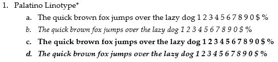
This is one I really like and use regularly. It is very professional-looking and easy to read, and gives a lot of vertical space between lines, making for a very crisp, clean appearance.
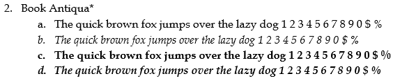
This has been a staple of mine for several years, now. Again, I find it very professional-looking and easy to read, though the vertical space isn’t as generous as it is in Palatino, so that’s why I’ve started to lean more towards the Palatino.
My Top 2 Sans Serif Resume Fonts:
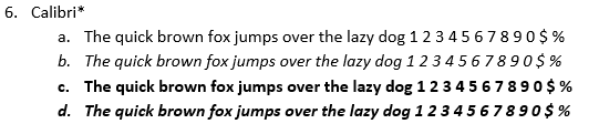
Speaking of Calibri – this font is the most recent default for Microsoft Word documents, and as such has become super popular for resumes. It has a very clean, crisp look and leaves plenty of vertical space between lines.
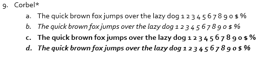
This font has always struck me as the playful younger cousin of Calibri and Cambria. It looks similar to both, but has a lighter appearance and takes the playful, creative vibe even further.
COLORS
You may have noticed some splashes of color in the resume examples included earlier in this blog (more resume examples here).
Resumes in 2021 – more than ever before – will include more color.
That said, resume color usage and effectiveness is largely dependent on industry, company, and job type.
More conservative or traditional industries / companies / jobs may not appreciate color as much as industries / companies / jobs that are more innovative or progressive.
So, if you’re applying for a job in finance or law, you may want to opt for a black-and-white resume; if you’re targeting a job in marketing or design, some well-placed color may be a huge benefit.
Beyond knowing whether color is right for your resume from an industry/company/role standpoint, it’s also important to understand how color interacts with online Applicant Tracking Systems (ATS).
Based on recent testing in some of the most-used ATS (shared by Certified Graphic Resume Architect Marie Plett in her webinar, How to Create Graphically Beautiful, Yet ATS-Friendly Resumes for the National Resume Writers Association), color in and of itself doesn’t affect the way the ATS reads your resume.
However, graphs, tables, charts, shapes, textboxes, and other ‘add-in’ elements DO affect how the ATS reads your resume – and it’s usually for the worse.
So, it’s important for any elements like that to be created in the document, then rendered as images and re-entered in the place of the original element.
Images can be fully ignored by ATS, so long as you mark the image as ‘decorative’. This will allow your resume to look great and be easily read by ATS.
Need a little more help deciding if color is right for your resume?
Let’s take a look at some other expert opinions:
- Back in 2017, Marguerite Ward said in a CNBC article stated that, “Color as a rule is a distraction”. While it’s been a few years since then, I think it’s safe to bet that many hiring managers still feel that way.
- A (more recent) Indeed.com article states, “The personality and character you show in your resume can help the reader decide if you would be a good fit for their company culture. If you are applying for a job at an office with an informal, modern atmosphere, a bright color scheme could help you stand out as a compatible prospect. Alternatively, if you are submitting your application to a company that is more formal or traditional, a muted color palette would likely be more successful. Researching the company ahead of time will help you choose colors that showcase your ability to fit in with their team.”
- On the subject of color psychology, Kendra Cherry says in a VeryWellMind article, “Despite the general lack of research in this area, the concept of color psychology has become a hot topic in marketing, art, design, and other areas. Much of the evidence in this emerging area is anecdotal at best, but researchers and experts have made a few important discoveries and observations about the psychology of color and the effect it has on moods, feelings, and behaviors.”
Taking color psychology a step further, let’s take a look at some of the most popular resume colors and how they affect moods, feelings, and behaviors.
RED
In reference to psychology, Cherry at VeryWellMind states that, “In color psychology, red provokes the strongest emotions of any color. While cool colors like green and blue are generally considered peaceful and calming, red is considered the warmest and most contradictory of the colors. In fact, this fiery hue has more opposing emotional associations than any other color: Red is linked to passion and love as well as power and anger.”
Word Associations:
- Danger and Warning
- Excitement and Energy
- Aggression
- Dominance
- Passion and Desire
- Power
From a marketing standpoint, a recent article from CoSchedule has Ashton Hauff saying, “Red is a very powerful, dynamic color that reflects our physical needs whether to show affection and love, or to portray terror, fear, and survival. Red is also a very energizing color that can portray friendliness and strength, but can also be demanding and show aggression depending on its context.
Overall, if you’re looking to have a really powerful presence or get someone’s attention fast, red is your go-to color. Just remember to use it sparingly to avoid the extreme negative reactions it can so easily awaken.”
BLUE
Looking first as psychology, Cherry asserts that, “Blue is a color often found in nature such as the pale blue of a daytime sky or the rich dark blue of a deep pool of water. It is for this reason perhaps that people often describe the color blue as calm and serene. Yet as a cool color, blue can sometimes seem icy, distant, or even cold.
Because blue is favored by so many people, it is often viewed as a non-threatening color that can seem conservative and traditional. Blue is often used to decorate offices because research has shown that people are more productive in blue rooms.”
Word Associations:
- Sincere
- Calming
- Intense
- Inspiring
- Stable
- Sadness
And from a marketing standpoint, Hauff at CoSchedule says that, “Unlike red, blue lends a more mental reaction rather than physical that allows us to destress, calm down, and think of the most ideal situation. Unfortunately, it also is one of the last colors to be seen, and can be perceived as distant, cold, or unfriendly if used it great amounts.
Overall, blue is a well-liked color that can bring a sense of calmness and trust when building relationships, especially in marketing.
Blue is one of the more popular colors as it stretches even beyond color blindness.”
GREEN
Cherry’s take on this color is that, “For many people, [green] has strong associations with nature and immediately brings to mind the lush green of grass, trees, and forests.
Green is a cool color that symbolizes nature and the natural world. Perhaps because of its strong associations with nature, green is often thought to represent tranquility, good luck, health, and jealousy.
Researchers have also found that green can improve reading ability. Some students may find that laying a transparent sheet of green paper over reading material increases reading speed and comprehension.”
Word Associations:
- Calming
- Exciting
- Compassion
- Nature
- Optimistic
On marketing, Hauff states, “Green is a color of balance and harmony. It lends us a clearer sense of right from wrong since green incorporates a balance of both the logical and emotional. Green is one of the most-seen colors in nature reflecting life, rest, and peace. It is also a sign of growth, whether that’s in a physical object like plants or in our income and wealth.
Overall, if you’re looking to portray health, rest, and to relieve stress, green is your color. While green does have minor negative aspects like over-possession and materialism, it has a more positive affect than most other colors.”
ORANGE
On psychology, Cherry says, “Orange can be a very strong and energetic color. Like yellow and red, it can be very attention-grabbing, which is perhaps why it is often used in advertising.
People often describe orange as bright, happy, and uplifting. In some cases, however, it can seem too bright and overwhelming. Much like purple, orange tends to be a controversial color. People tend to either love it or hate it.
Orange is often used to draw attention, such as in traffic signs and advertising. Orange is energetic, which is perhaps why many sports teams use orange in their uniforms, mascots, and branding. Orange is also the color of bright sunsets and fruits such as oranges and tangerines, so many people might associate the color with the beauty of a setting sun or the refreshing taste of citrus.”
Word Associations:
- Spiritual
- Energetic
- Attention-Getting
- Happy
For marketing, Hauff says, “Orange has a very interesting psychological meaning as it combines red’s power and energy with yellow’s friendliness and fun. The mix makes orange a good representation of physical comfort in our warmth, food, and shelter. (It even stimulates our appetite so watch out if you’re hungry!)
Orange is also known to be a color of motivation, lends a positive attitude, and general enthusiasm for life. Overall, orange is great for bringing comfort in tough times, and creating a sense of fun or freedom in your visuals.”
PURPLE
Cherry: “People often describe this color as mysterious, spiritual, and imaginative. Purple tends to occur rarely in nature, so it is viewed as rare and intriguing. While violet occurs naturally in the visible spectrum, purple is actually a combination of blue and red.
Like many other colors, the feelings that the color purple evokes are often due to cultural associations.
Visually, purple is one of the most difficult colors to discriminate. It also has the strongest electromagnetic wavelength, being just a few wavelengths up from x-rays and gamma rays.”
Word Associations:
- Regal
- Sensual
- Wealth
- Wisdom
- Mysterious
- Exotic
GREY
Cherry: “In color psychology, grey represents neutrality and balance. Its color meaning likely comes from being the shade between white and black. However, grey does carry some negative connotations, particularly when it comes to depression and loss. Its absence of color makes it dull. Grey can be used for font color, headers, graphics, and even products to appeal to a mass audience.”
On marketing, Nicole Martins Ferreira says in a recent Oberlo article, that “Apple is an example of a brand who uses the color grey in their branding. After all, many of their laptops are in a grey or silver-tone as its neutral color doesn’t put anyone off. On their website, they use the color grey for their header to contrast against a white logo. However, throughout their branding, you’ll see a balance between white, black and grey used which can help maintain a clean, neutral look.”
Looking for more insights?
Job searching is tough stuff! Whether you’re completely stuck or just need some strategic guidance, I’ve got you covered.
- Get a powerful 5-step Action Plan to Write an Interview-Getting Resume now and receive expert career insights straight to your inbox.
- If you’re ready to take serious action on your career and you’re looking for a resume and job search pro, Apply Now for a strategy call with me!