9 Best Resume Fonts Recruiters Don’t Hate
(Including My 5 Favorite Fonts)
It may seem like a low priority issue, but the font your choose for your resume can have a major impact on whether or not you’re chosen to interview for your dream job.
I know what you’re thinking: ‘Really, lady? Some hiring manager is going to decide they don’t like my Times New Roman resume and just completely disregard it?’
No, of course not.

(Well actually, yes – especially in the case of Times New Roman. Though some articles as recent as this year will tell you that it’s still acceptable – it’s not. Times New Roman is the Nickelback of resume fonts.)
So, if it won’t get your resume immediately thrown out by a decision maker, what’s the big deal?
The big deal is that the wrong font could potentially keep your resume from reaching a decision maker in the first place.
 (Wait, what?)
Yeah. The reason is because modern recruiting automation tools and technologies are making it increasingly difficult for resumes to make it through to reach real human beings. For instance, a majority of companies, large and small, use Applicant Tracking Systems (ATS – software applications which can be programmed to search for given qualifications, skills, experience, and keywords) to scan and filter resumes. If the ATS doesn’t see enough of what it’s looking for, the resume gets discarded.
There are nearly 200 ATS options on the market, and you usually won’t know what company uses which system, so you want to be sure your resume font can be read easily read by most of them.
If the ATS doesn’t recognize your chosen font, it will only see this:
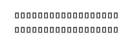 (Not a very compelling presentation of your skills, is it? Yeah, the ATS won’t think so either.)
More importantly, the ATS won’t see any of the keywords it has been programmed to find, and will discard your resume automatically.
Knowing all of that, I’ve compiled below a list of 9 of my favorite fonts (including 5 that I actually use on client resumes) that are ATS compliant and approachable enough to please just about anyone.
First, let’s talk a little about the difference between serif and sans serif fonts.
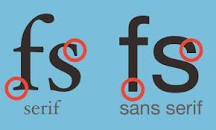
If you’re unfamiliar with the terms, serif fonts are those with semi-structural details or small decorative flourishes on the ends of some of the strokes that make up letters and symbols. Sans serif fonts do not have these details or flourishes. (See below)
(Pretty simple, right?)
Wait, stop – there’s something I need to get off my chest. Before we go any further, I should probably make a confession:
My name is Lezlie Garr, and I prefer
serif fonts over sans serif – especially for resumes.
 (Yes, it’s true. Don’t judge me…)
Okay, I know Sans serif fonts have definitely taken the forefront, lately. Considered more modern, hip, and informal, they have become popular on websites and in marketing, advertising, sales, and any other public-facing platform – especially by companies who want to be perceived more modern, hip, and informal, themselves. You can recognize sans serif fonts not only by their lack of ornamentation (as mentioned above), but also but their typically wider and more rounded shape.
Serif fonts are known as being more formal and more traditional, which is why I prefer them for resumes and most any written documentation or communication in a professional setting. You can recognize them not only by their ornamentation, but also by their typically more narrow and square/boxy shape.
Both font styles are generally considered acceptable, but since each carries a different ‘image’, it may be smart to choose based on your industry or job type.
According to Hannah Craig in a recent Jobscan article:
“If you’re applying for highly compliant, regulated, or formal fields, serif is the way to go. Serif fonts are perceived as reliable and traditional. They lend an air of authority. Use this to your advantage if you’re working in finance, law, or science or if you’re applying to companies with a long history and formal structure.If you’re working in innovative and newer fields, sans serif is a good fit for your resume. Sans serif fonts are perceived as modern and clean. They imply innovation and simplicity. Sans serif fonts work well for applications to young companies on the cutting edge looking to be disruptive and in creative or emotional fields such as marketing or writing.”
Now on to the fun stuff – examples!
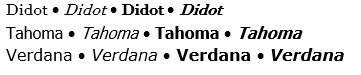
We’ll start with Serif, since those are my favorite. Fonts marked with an asterisk (*) are ones I use regularly with clients.
SERIF
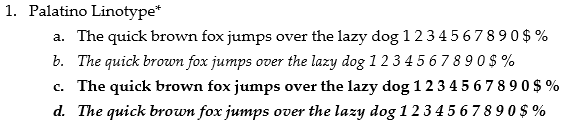
This is a new one for me, and one I really like. It is very professional-looking and easy to read, and gives a lot of vertical space between lines, making for a very crisp, clean appearance.
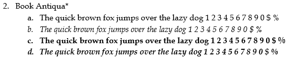
This has been a staple of mine for several years, now. Again, I find it very professional-looking and easy to read, though the vertical space isn’t as generous as it is in Palatino, so that’s why I’ve started to lean more towards the Palatino.
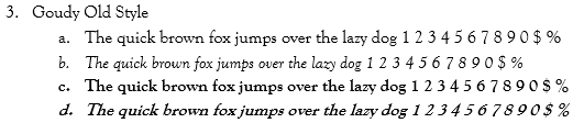
While also clean and easy to read, this font has a bit of playfulness to it, which can work well for more creative fields or for younger/start-up companies.
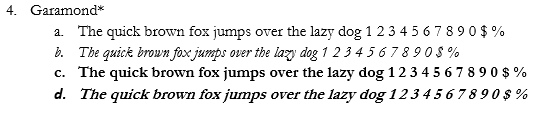
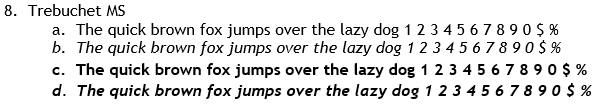
This font takes the playful vibe a little further, especially in the italicized versions. However, it is one that is regularly mentioned as acceptable, so I don’t think it goes ‘too far’.
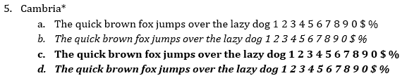
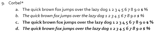
While this is still a serif font, the letters take on a much more rounded shape than most other serif fonts. I’ve always thought of Cambria as the Calibri of serif fonts.
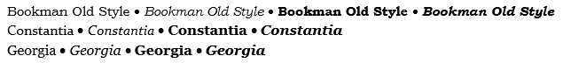
Other Acceptable Serif fonts:
Want more resume insights? Sign up to get your 5-step Resume Action Plan now!
SANS SERIF
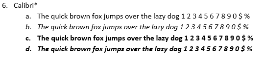
Speaking of Calibri – this font is the most recent default for Microsoft Word documents, and as such has become super popular for resumes. It is has a very clean, crisp look and leaves plenty of vertical space between lines.
This font has a very similar look to Calibri, though it is a bit wider and has just a bit more flare, especially in the italicized versions.
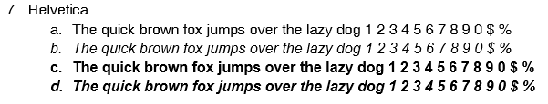
This font has a more narrow, tall look, which cuts down on the vertical space between lines, but doesn’t lose any readability because of it. It takes the playfulness of Helvetica a step further, without overdoing it.
This font has always struck me as the playful younger cousin of Calibri and Cambria. It looks similar to both, but has a lighter appearance and takes the playful, creative vibe even further.
Other Acceptable Sans Serif fonts: